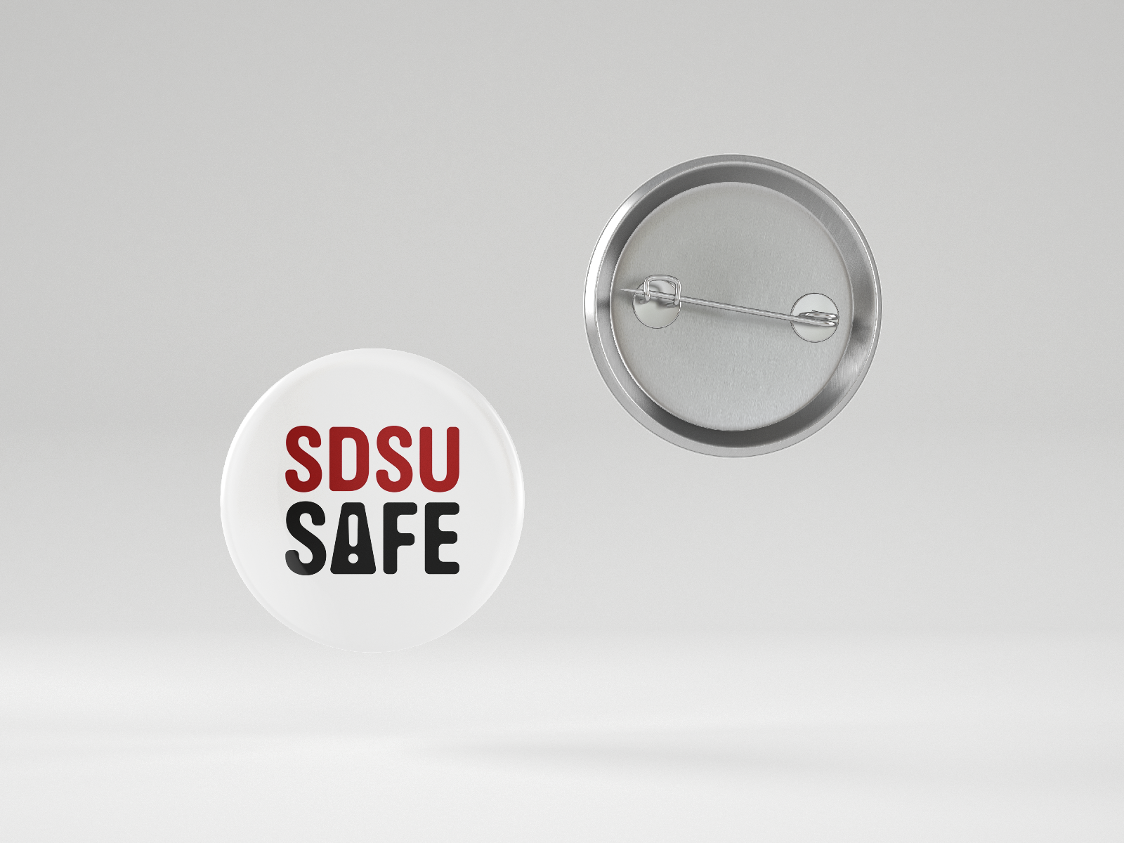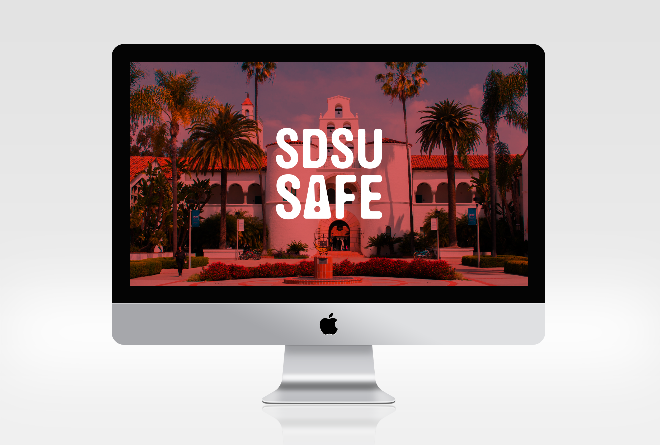
SDSU Safe
Spring 2022 / Typography III / James Bowman
Category: Branding
Program: Illustrator, Photoshop
Challenge
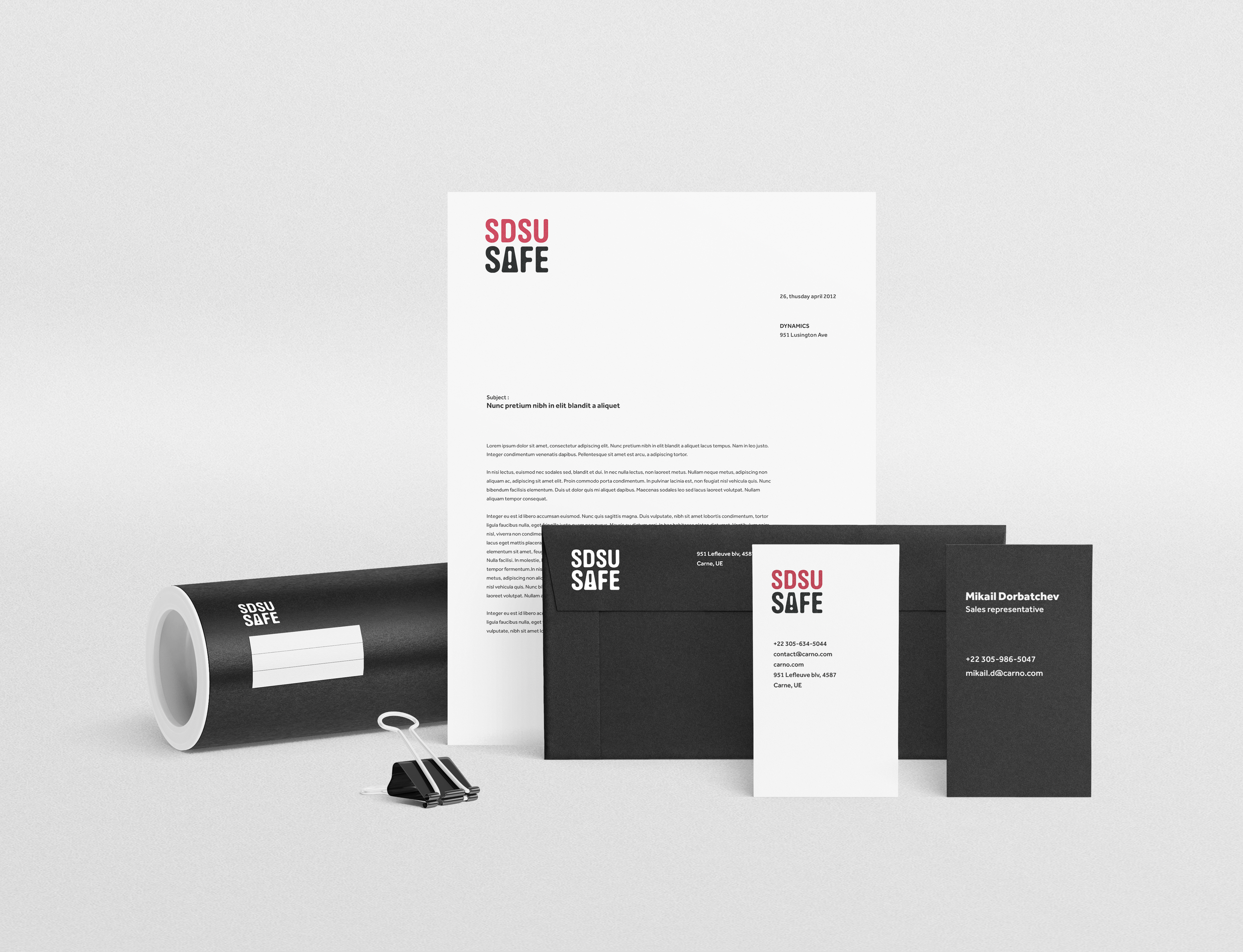
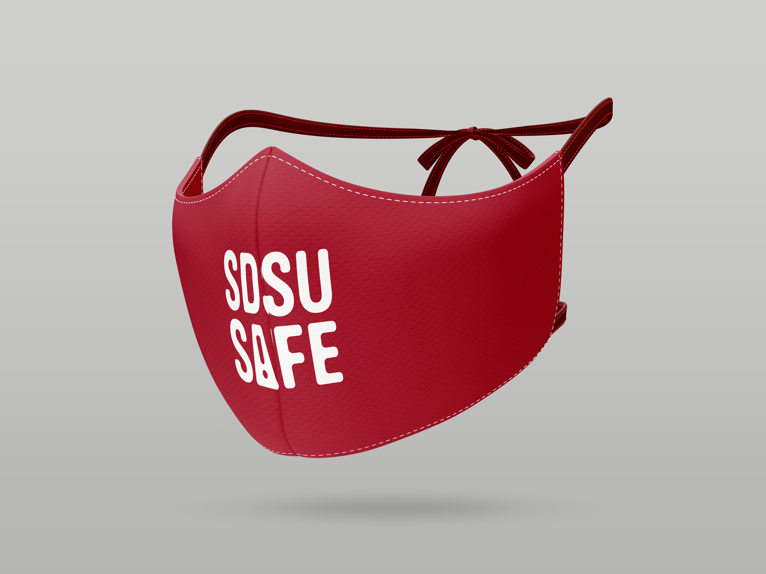
The SDSU Occupational Safety department reached out to the ART 442 class and tasked us with creating an original logotype and applying it to various touchpoints.
Solution
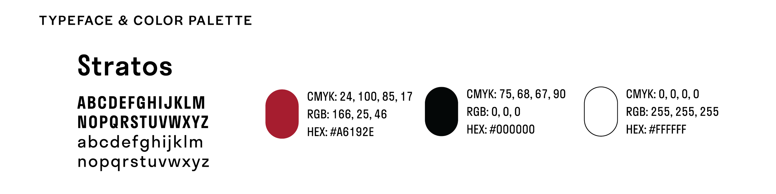
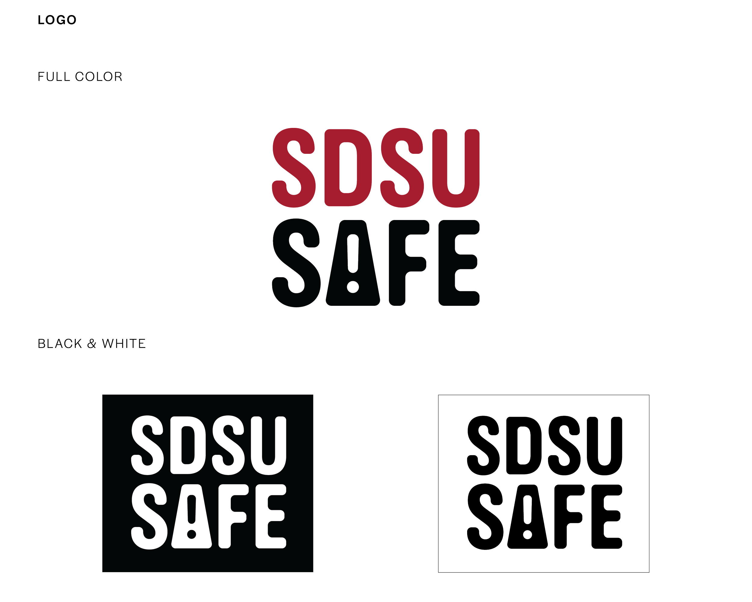
Using our university’s school colors of scarlet and black, I created a logotype using a simple, friendly sans serif with rounded corners and combined it with the hazard symbol/exclamation mark within the “A” letterform.